Friday 26 October 2012

MESSAGE & DELIVERY - RESEARCH CRIT


Today I had a group crit with Simon. We congregated around a table with our collected research. In turn, each person presented their visual research explaining key points and information about their chosen story.  

My research was conducted on Fidel Castro, the revolutionary Cuban leader. I had collected pictures that almost formed a timeline of his life. Starting with pictures of Castro in his University days, up until the photos he recently released to the press to prove his health.

The feedback I received was helpful and will help me refine my research. Firstly, it was mentioned that I should research into why there are rumours that he is dead, apparently it is not the first time that it has happened. Moreover, I also need to research into Castro’s relationship with the western world. Finally, towards the end of my research I looked at some propaganda used for Castro’s regime, I want to research further into the propaganda used by Castro and different forms that it takes.   

Monday 15 October 2012

QUESTION 5

Is your writing style formal or informal?

QUESTION 4

Have your design decisions been evidenced?

QUESTION 3

Has all work been blogged?

QUESTION 2

Is your work posted on the correct blog?

QUESTION 1

Have you managed your time effectively?

40 MINUTE EXERCISE


In today’s studio briefing we discussed ‘What is higher education?’ we talked about things such as the definition of words associated with education such as ‘teach’ and ‘education’. Moreover, we also learned about different learning techniques and feedback methods.

After the lecture we were split into our blog groups ready for exercise. We initially were asked compose a list of things we would like feedback on, we had to consider how much work we have done so far, and if it is already assessed regularly.

What I want feedback on;

1.       Research – Is there enough? Is it annotated?

2.       The tone of voice used while writing on my blog.

3.       Standard of work

4.       Time management

5.       Quantity of work


Then as a group we compiled a list of common things we wanted feedback on. We composed the list on a sheet and added evidence of what could be assessed for feedback.


1.    Blog

2.    Annotation

3.    Work

4.    Research

5.    Amount of work

6.    Whether blog is labelled appropriately

7.    Use of media

8.    What level

9.    Essay


Evidence

1.    Our blog

2.    Written work

3.    Experimentation/development


Next, as a class we pooled our ideas together to form a list of refined ideas.

Group list;

1.       Use of blog -      Content

                                          Tagging

                                          Organisation

                                          Quantity

                                          Quality  (Text & Image)

2.       Assessment Criteria

3.       Time management

4.       Academic/Writing skill

5.       Critical evaluation

6.       Quality of work

7.       Design decisions

8.       Understanding of design principles

9.       Individual improvement

10.   Appropriate responses


From this refined class list we had to write questions, these would later be used to assess the members of my groups’ blogs. We also had to make a note of how we would check if they had achieved the question.

1.       Has there been an effective use of time management? (Check times and dates of blog posts)

2.       Is the content labelled correctly and clearly? (Check blog titles and content)

3.       Is there a good balance of annotation and image? (Check blogs)

4.       Has all work been posted in the correct place? (Look through briefs and blog content)

5.       Is the blog up to date with work? (Look at briefs and compare to work posted on the blog)

6.       Are design decisions evidenced? (Read through Design context and design practice)

7.       Is the writing style formal or informal? (Check vocabulary used)

8.       Are all images linked? (Check images for reference)

9.       Are all the posts in order? (Check dates of posts compared to briefs)

10.   Are all blogs linked to the homepage? (Check if links work)

We then had to select five questions that we would then be evaluated on. These have been posted as individual posts on my PPP blog.


Sunday 14 October 2012

STUDY TASK 3 - WHAT IS GRAPHIC DESIGN

Design contexts

In Fred's session today we discussed Graphic Design and its different functions and contexts. At the end of the session we were asked to collect visual responses to the list of prompts below. Each had to be accompanied by a short explanation as to why the image has been chosen. 
  • identify a range examples of Graphic Design appearing in different design contexts.

Context

Magazine cover
This magazine cover created for 'Fat Magazine' mixes subtle greyscale photography with contrasting metallic typography, the outcome has a minimalist feel and is visually striking.


Pizza Packaging 
Above is a fine example of pizza box packaging. Designed for Dominoes, the box uses a limited colour pallet with letter press styled typography. The fonts all mix well and a clear hierarchy of type can be seen. 


Album cover
This simple album cover created for 'Coeur De Pirate' uses a mixture of illustration and photography to form an eye catching piece. Once again, the contrast of the black and white photo and metallic overprint  creates a really striking piece.


Poster, Advertisement
This poster was created to advertise a website promoting alternative travel such as the bicycle, using photography and typography to communicate the message.  


Poster, Advertisement 
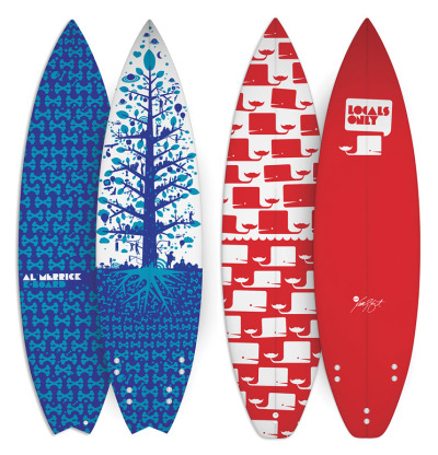
Illustrated posters created for a Ripcurl surf event in San Francisco. The posters work as a set and have a fantastic balance of colour.


Logo.
Simple yet effective logo.


Branding and Identity.
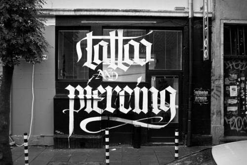
Stylish branding done for a clothing company. The focus of the identity is based around the script typographic logo. Moreover, there is also a hand print influence through the use of stamps.


Cd and box design.
Above is a DVD box set of Quentin Tarantino's films. The design mixes typography and illustration to create an aesthetically appropriate identity. 


  • Identify a range examples of Graphic Design performing different functions

Function

Logo defining company values.
A simple logo that reflects the company values. The retro 'Barber shop' type mixes well with the script type below, the logo is well balanced and recognizable.


Advertisement
Poster created by 'R3DO' advertising Beirut in Mexico. The poster places typography and illustration over what would otherwise be a normal photograph making the image interesting and eye catching. 


Advertisement
Fantastic poster advertising an album launch party. The poster uses a limited selection of typefaces that mix well on the page. Moreover, there is also a limited use of colour which ensures the poster is not too visually overpowering.


Poster
Striking illustrated poster

Magazine front cover
The cover illustration is amazing and is balanced well with the script style typography.


Album cover
Mixes subtle colouring and well executed illustration to create a striking album cover.


Advertisement - Poster

A limited colour pallet of well chosen colours and an inventive composition make this a striking poster.

  • Identify a range examples of Graphic Design communicating different types of messages/ideas/concepts

Messages

Selected GigPosters, 2004-present on the Behance Network
Gig poster, uses illustration and typography to communicating/advertise the gig.

Logo, communicating company ethos.

Color psychology in logo design.
Inforgraphic, informing audience about colour theory.

All sizes | DixonBaxi Retrospective | Flickr - Photo Sharing!
 DixonBaxi Retrospective

2011 EPIC Awards Identity by Hyperakt

Hotel brochure. 

  • Identify a range examples of Graphic Design using  a different tone of voice.

Tone of Voice


Bong Spirit Vodka imported from Holland
Bong spirit Vodka imported from Holland. Bottle reflects some of the culture associated with the Netherlands.  

propaganda.
Dinosaur propaganda.


Love the idea behind this logo... Architecture styled T & A. beautiful.
Logo design done for architectural firm.

Just In Case by MENOSUNOCEROUNO , via Behance
Just in case company branding.

24 Smart Graphic Design Resumés.
Graphic design Curriculum Vitae.
  • Identify a range examples of Graphic Design produced at different scales/places

Scales

Friday 12 October 2012

PROGRESS CRIT

ALPHABET SOUP - TASK 2 - CRIT FEEDBACK


Today I presented my start on the second part of the alphabet soup brief. Task two asked us to make an alphabet that represented the personality or character of our partner. Below are things I learned from the crit.

Firstly, I only had ideas and research to present to the group, as I had not managed my time well enough to present physical mock ups of my alphabet. Due to this my work could not be criticised properly. I need to manage my time more appropriately and make sure i am not unprepared for the next crit.

Secondly, it was mentioned that my research was strong but I needed to start my experimentation earlier in the design process. 

Thursday 11 October 2012

ALPHABET SOUP - TYPEFACE

Alphabet soup - Typeface


Firstly, the focus of this task was to produce an alphabet that portrayed my partner’s personality. In my research I noted down key points of Melissa’s personality, such as her favourite animal and hobbies. I wanted to combine illustration and collage to produce the letterforms as I believe this is best way of visually communicating Melissa’s personality. Below are the letterforms I produced.

(ADD ALL LETTERFORMS)

As a whole I think that the font achieves its purpose and portrays Melissa’s personality well. During the group crit (conducted on the day of our studio deadline) Melissa mentioned that the letterforms portray her character accurately, and all the main character traits such as her hobbies had been in included in the typeface. It was sometimes tough adapting objects to achieve a legible letterform, and still involve some aspect of her personality. However, I overcame this problem by looking at what it was that prevented the letter from working, then re-produced the letter amending the prior mistakes. I continued this until I had a letterform I was happy with. 

One of the mandatory requirements of the brief was that we produce an A1 sheet presenting our letterforms and glyphs. We traced our letterforms onto tracing paper and presented at our group crit, due to the nature of my letters this was a very lengthy process. Presenting my work in this way made me consider the sizing of my letterforms, fitting them on the sheet was not a problem as I produced my alphabet onto ten by ten squares. However, it did make me think about the sizing of my font. Would my letterforms still be legible at a small size? And what size would be best to present them?


I discovered the answer to the first question when making Melissa’s name badge. I scanned in the letters needed for her name and began to scale them to the right size, they were legible however, and some of the illustration detail was lost. When I was designing the letters I made a point of utilising a thick black outline, I believe this helped the legibility of the letters when scaled down. Moreover, I made the choice to produce my letterforms in uppercase. I chose uppercase because of how I produced my letters. As I was mixing illustration and collage it would be very difficult to create small rounded lowercase letters. 


Finally, in the crit it was mentioned that my letterforms where more of a display font rather than a typeface due to a mixture of unusual form and detail, so some functionality is lost. Moreover, as single letters the objects hold no meaning and therefore have no function. There are similarities between some letters but some words could look completely disjointed because of the range of graphic content.  I believe next time I will produce an alphabet that not only achieves its purpose but also works as a typeface and display font.