
What is graphic design?
During this lesson,
we got into our usual blog groups and each presented the research previously posted on our PPP blog. The research contained a series of
inspirational images so it was interesting to see what each person in the group
found inspirational. While each person was explaing their images we took notes
on what it was that made them like the piece they where presenting, forming
a list under each person’s name. This was a good exercise, as not only did I learn
more about my groups’ interests but also liked a lot of the work that was
presented. Below are the lists that I collected for each person.
James
Negative space
Clean simple design
Limited colour ways
Science fiction
Futuristic
Kirsty
Illustration
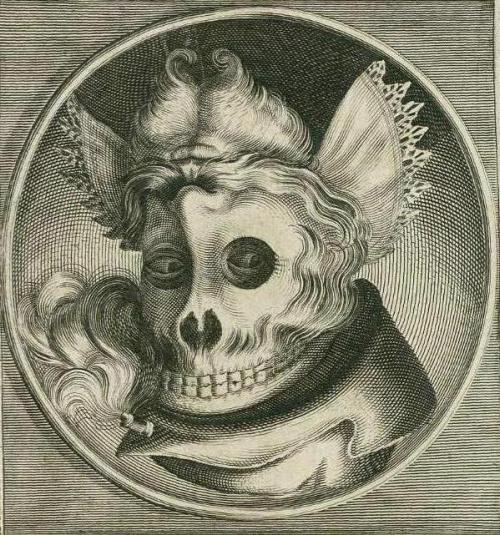
Sam Lemon – Human skeleton tube map
Thought provoking design
Roy Lichtenstein
Terry Richardson –
Photography
Kate Moross – Type
Laura
Fabien Barral – Fine illustration
Clean precise work
Black on white – colour hints
Glossy.tv magazine
layouts
Clever logo designs
Stylish company branding
Jamie
Bubbalicious – Packaging
Jeff Mermelstein – Street photography
Stefan Sagmeister
Street art
Peter Saville
Kate Moross
Crack magazine – Contemporary
design
Experimental media
The XX album cover –
Spray paint
Daisy
Negative space
Pastel colours
John Moss – Comedy value
Innovative, experimental design
Infographics – Layout
Antony Burrows – Prints
Simple illustrations
Simon Page – good use of colours
Alex
Ben-Ashton Bell
Drew Millward
Michael Shantz
Banksy
Julene Harrison
Kai Isselhorst
La Dispute
Nicole Jopek
Ollie Keable
Sabrina Ward Hsrrison
Next, the whole class collaborated to form a group list of the most common reasons that had been noted down during the session.
Class Interests
Negative Space
Minimal/Clean/Simplistic design
Detailed/Effective illustration
Visually pleasing
Eye catching
Comedy/Humorous
Printed media
Packaging/Branding
Magazines/Zines/Books
Photography
Colour schemes
Meaning behind work
Typography
Hand rendered
Interests
Mood of the piece
We next had to refine our list and select five interests, then choose
example imagery in relation to each interest. Below are the interests I will
collect imagery for.
Creative use of type
Visual quality
Detail
Hidden messages
Style
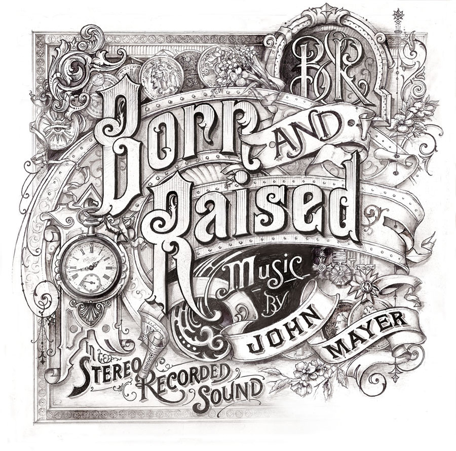
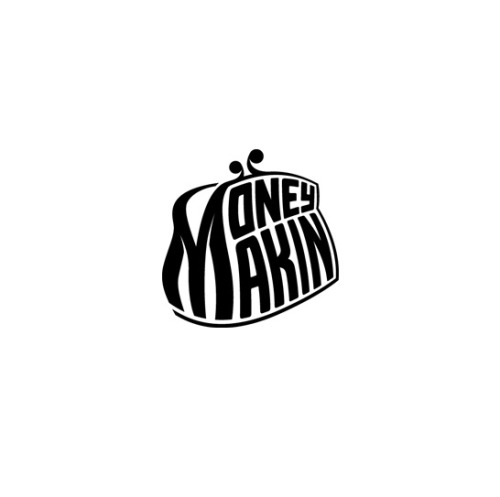
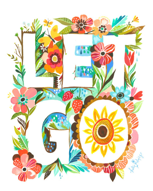
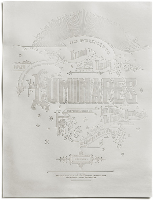
Below are my selected images for 'Creative use of type', I aimed to collect a range of different images showing style variations I have an interest in.


Creative use of type
Below are my selected images for 'Creative use of type', I aimed to collect a range of different images showing style variations I have an interest in. 
This typographic piece created for brand 'Zoo York' cleverly uses intertwined letters, the piece initially caught my attention due to its likeness to graffiti.

Moreover, this poster created by 'Joel Felix' for the 'Craft Spirit Carnival' mixes typography and illustration. The retro styled type is striking and works effectively at communicating the playful carnival context.

The Letters Poster by Fifty Five Hi’s and Skinny Ships.

I find this letterform inspirational due to the style of illustration.
Amperbranch by Ryan Putnam

1994
H180, W230, D5cm
Wood, single light source, shadow
Microsoft Art Collection, Washington USA

Type treatment by Simon Ålander. Very similar to the work of Dan Cassaro, a typographer who I have been following for a while.
The above link is for a video following Jon Contino for an afternoon, well worth a watch.


The above illustration has cleverly been adapted to look like a letter-form.

I find the above typography really interesting, the messy hand written style and differentiation of letter thickness remind me of fonts used to brand some of my favorite skateboard companies such as 'Chocolate'.

This alphabet further explores the crossover in shape between objects and letterform. Furthermore, this is also relevant to my 'Alphabet Soup brief'.

Moreover, this alphabet may not necessarily work for body copy, due to the decorative curls of each letter. However, as a display font, the type would work. I am inspired by this piece as I find the experimental letter form engaging and composition of the alphabet interesting.

This typography was created by Russian designer and typographer Sergey Shapiro. I am really interested in Sergey's work as he creates striking script style typographic pieces that often have a hand rendered element that I find aesthetically engaging.
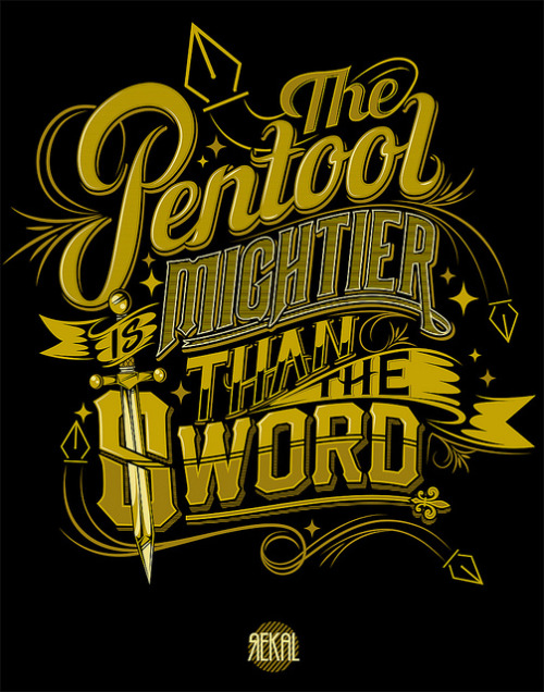
This piece was created by graffiti artist 'Rekal', he produces various typographic prints as well as spray painted pieces. I found this piece interesting as it mixes various typefaces with decorative illustration to create an interesting composition and effective outcome. http://www.flickr.com/photos/rekalskee/6361398183/
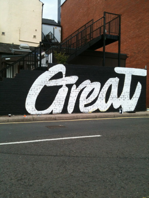
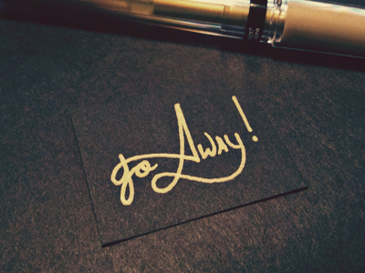
Moreover, I am also insppired by the scale of this piece, I also have a realy interest in hand rendered typography, either sketched or painted.Typeverything.com“Great” For The Great Gatsby pub in Sheffield by Lord Bunn

Additionally, I also find typographic pieces interesting that cleverly adapt materials or letterform to strengthen their relevance to the content of the word portrayed.http://www.behance.net/gallery/BLOW-type/4831421


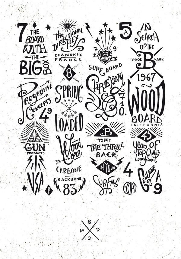
The above designs were created by BMD Design, they specialize in hand-rendered typography. This style of typography is really appealing to me due to my interest in hand drawn typography, I want to experiment with creating similar pieces in future briefs.
http://www.behance.net/gallery/Graphic-hand-lettering-boards/4962775

http://monaux.com/play/ulysses-tea/
Hand typography design by 'MONAUX'
Typeverything.com
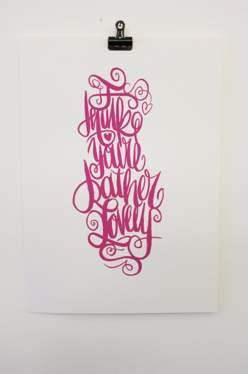
“I Think You’re Rather Lovely” by Lord Bunn.
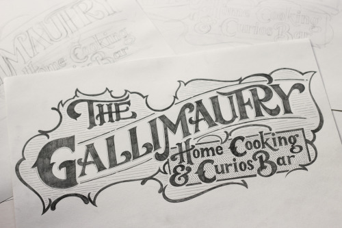
The above piece is a pencil drawn design from Davis Smith, I that the composition of the design and the amount of detail is inspiring.
Moreover, this type has been cleverly adapted, and support the context of the piece.


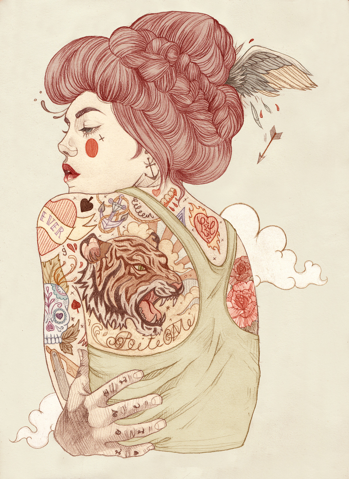
 I love this identity work done for Bailey Hunter Robinson, a tattoo artist from America. The design work was done by Two Arms Inc.
 The colour scheme of this alphabet by 'Felix' , mixes tertiary colours. This works really effectively and creates a strong visual theme.
Moreover, I am also insppired by the scale of this piece, I also have a realy interest in hand rendered typography, either sketched or painted. |
| Typeverything.com“Great” For The Great Gatsby pub in Sheffield by Lord Bunn |
 Additionally, I also find typographic pieces interesting that cleverly adapt materials or letterform to strengthen their relevance to the content of the word portrayed. |
| http://www.behance.net/gallery/BLOW-type/4831421 The above designs were created by BMD Design, they specialize in hand-rendered typography. This style of typography is really appealing to me due to my interest in hand drawn typography, I want to experiment with creating similar pieces in future briefs. http://www.behance.net/gallery/Graphic-hand-lettering-boards/4962775 http://monaux.com/play/ulysses-tea/ Hand typography design by 'MONAUX' Typeverything.com “I Think You’re Rather Lovely” by Lord Bunn.
The above piece is a pencil drawn design from Davis Smith, I that the composition of the design and the amount of detail is inspiring.
Moreover, this type has been cleverly adapted, and support the context of the piece. |
I love this identity work done for Bailey Hunter Robinson, a tattoo artist from America. The design work was done by Two Arms Inc.
Illustrative typography.
This clever hand typography by Serji Gold, links elements of certain letters to form a flowing piece.
Visual Quality
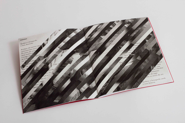
Next on the list was visual quality, I tried to select a range of images that not only displayed work that I am interested in, but also showed how visual quality can be achieved through a range of different media.


This screen printed poster is amazing, the detail that have been achieved is impressive and inspiring. Moreover, screen printing is an outcome that is in my personal interest, and is something i hope to experiment with in future projects.
 |
| Moreover, I have a real interst in illustration, I am inspired and interested in illustrative pieces like the one shown above. I hope to experiment with using illustrations in my design work when a relevant brief is set. http://designdetox.com/post/20854437270/liz-clements-illustration |
 |
| Additionally, I am also interested in experimental magazine layouts and editorial design. http://bimbaam.tumblr.com/post/34761601487/bim |
 |
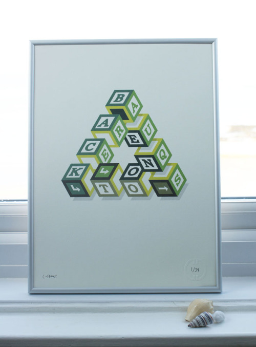
| I am also interested in geometric designs that use a combination of shapes to create form. http://pinterest.com/pin/47006389830939710/ |
 |
Detailed biro illustration
|
 One of my hobbies and interests is skateboarding, there is a strong community of designers, artists and illustrators surrounding the culture, I find a lot of the illustration work interesting, such as the design on this cruiser deck. |
http://pinterest.com/pin/272608583664346675/ http://www.kindredstudio.net/51212/446845/design/kingpin-skate-supply Skateboard designs by Kindred studio 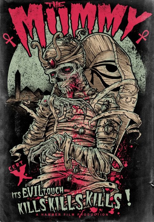 http://godmachinedesigns.blogspot.co.uk/ I really like the illustration and the layout of the poster by artist Godmachine. 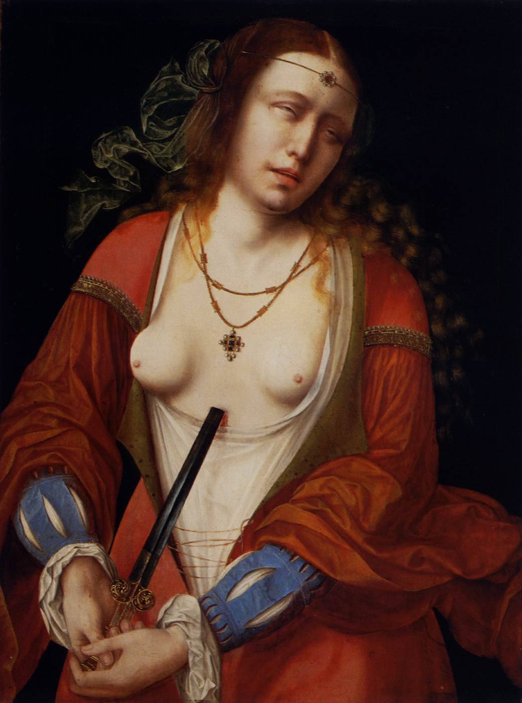 This painting was done by Master of the Holy Blood Lucretia 1530 Museum of Fine Arts, Budapest, Hungary (Painting, Oil on panel, 65 x 49 cm) http://oldroze.tumblr.com/post/30160637591/artist-master-of-the-holy-blood-lucretia-1530 http://www.wga.hu/html_m/m/master/holybloo/lucretia.html 
This simple poster design created by designer Benjamin Garner uses an unusual poster size and was scree printed using three inks. As a designer I am interested in producing posters for advertisement and artistic purposes.
 Photography form Troy Moth. |
Detail

This pencil illustration is a good example of detail.
http://pinterest.com/pin/174866398000982238/

Moreover, I have recently been researching into infographics, I am interested creating inforgraphics as they give the designer a chance to make boring data or information visually engaging, which can be a challenge.
http://pinterest.com/pin/277604764502242161/

This poster by Apfel Zet Graphic Design, is a good example of the fine detail that can be achieved.
http://pinterest.com/pin/34832597087439621/

Moreover, this piece of work by 'Nick Patchitt' titled 'Everything Important about London', uses small icon illustrations to create a large circle composition. I am interested in digital illustration, and worked producing something similar to this for my summer project.
http://www.neatorama.com/2011/03/12/everything-important-about-london/
Moreover, I have recently been researching into infographics, I am interested creating inforgraphics as they give the designer a chance to make boring data or information visually engaging, which can be a challenge.
http://pinterest.com/pin/277604764502242161/
This poster by Apfel Zet Graphic Design, is a good example of the fine detail that can be achieved.
http://pinterest.com/pin/34832597087439621/
Moreover, this piece of work by 'Nick Patchitt' titled 'Everything Important about London', uses small icon illustrations to create a large circle composition. I am interested in digital illustration, and worked producing something similar to this for my summer project.
http://www.neatorama.com/2011/03/12/everything-important-about-london/

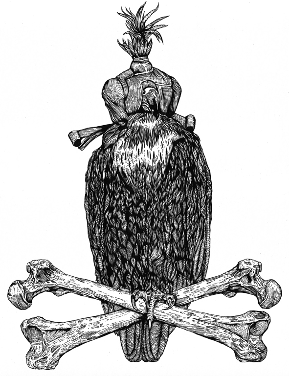
The fine repeated lines used by 'Funeral French' in his illustrations create both texture and detail.


Hidden messages

'Let There Be Light' is a poster by Kevin Cantrell inspired by Map insurance.
It is printed on cordenons moondream, which turnes transparrent upon heat stamping.
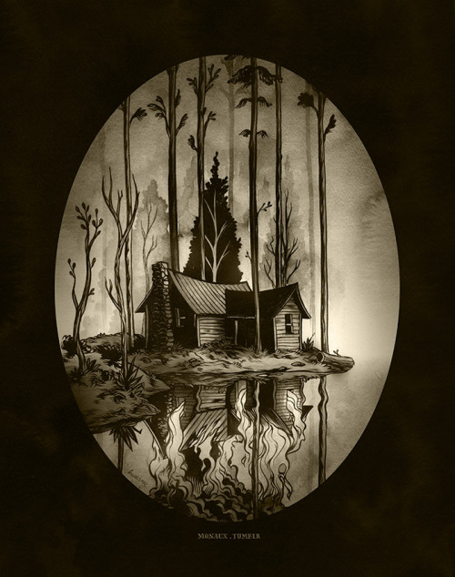
This illustration created by 'Monaux' is inspirational to me because at first when I glanced at the piece I didn't notice the burning house reflected in the water.
http://monaux.tumblr.com/
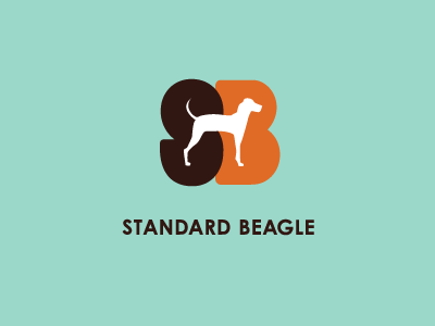
Clean, simple logo design from Rebecca Jarosh cleverly uses the silhouette of a beagle to create negative space. This further defines the letter forms.

Moreover, this book cover for 'The Kama Sutra' uses negative space to create the illusion of two figures, this would be a valuable technique if printing costs are low.
http://pinterest.com/pin/207447126556646384/
Moreover, this book cover for 'The Kama Sutra' uses negative space to create the illusion of two figures, this would be a valuable technique if printing costs are low.
http://pinterest.com/pin/207447126556646384/
Style
I have chosen to feature this piece as it is typical of the artists style. Alot of 'Monaux's' illustrations are created in a similar style, also similarities can be noticed across a lot of his typographic work.

These postcard designs mix simple illustrations with centrally placed type, this gives them a modernist feel as the style in which the have been created is similar to some modernist poster designs.
http://pinterest.com/pin/128915608055630942/

Simple skateboard design by Draplin Design Co.


A further example of an illustration style that artist 'R3DO' has adapted to his designs.


No comments:
Post a Comment