Friday 30 January 2015

PPP3 - NOTEBOOK PRODUCTION

Images below document the step by step process of creating the sustainable notebooks, from trimming the collected paper to binding the individual booklets. 


COLLECTED PAPER 

The image below displays the range of waste paper stocks that were collected throughout the first five months on the course. 

The stock, which will form the covers and interior pages of the notebooks, was collected from bins and tables from around the university, and so would have otherwise been sent to be recycled. By collecting and using waste paper stock instead of buying some recycled stock from the internet I am able to vastly reduce the carbon footprint associated with the notebooks.


CARBON REDUCTION -
  • Saves the energy associated with sorting, transporting and recycling the waste paper.
  • Saves having to buy new recycled stock for the notebooks helping to avoid the energy use associated with making and transporting the recycled paper.


Stock collected over a four month period. 


I also collected some recycled grey board for the notebook covers that had previously been used to print business cards. Luckily for me, the board was unused due to a misprint. 


TRIMMING

The stock that was collected came from a range of sources and undoubtedly had been used for a range of purposes. A consequence of using waste paper was the varying sizes of the individual sheets. One of the first major tasks that needed completing as part of the project was the process of trimming all the sheets down to the same size. 

Paper was trimmed using the guillotine. 
As the collected stock came from a range of sources individual sheets varied in size. 

Paper was trimmed to an A4 size so that when folded it met the outlined individual page size of A5.


NOTEBOOK PRODUCTION 

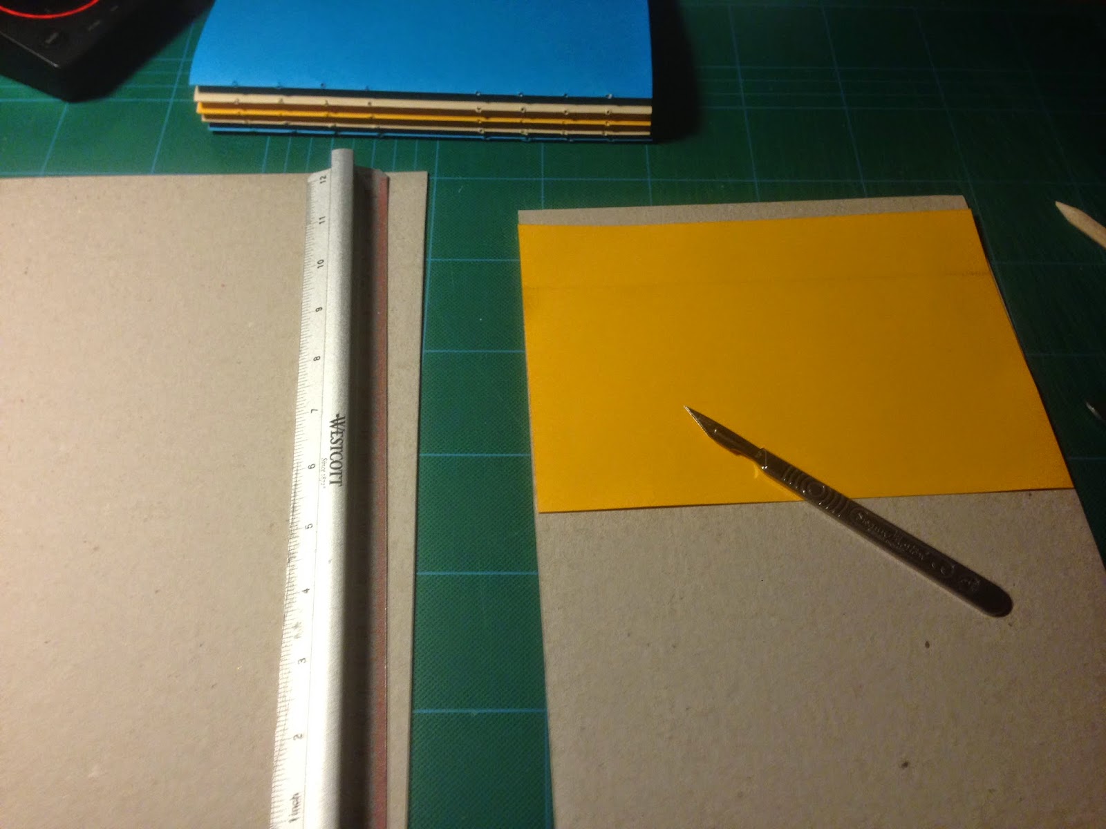
The sheets of trimmed paper were taken back to my house where I completed the various stages of the binding process. 

Tools used during the binding process. 

Folding the paper was very tedious and took over three hours. 
Paper was arranged into piles of stock type, this helped when creating the individual signatures.
The signatures consisted of six folded pages and varied in stock type giving the books a lot of character. 
An etching needle and custom template were used to pierce holes through each signature.  
Each booklet will feature five signatures giving a total of 120 individual pages. 
A singular signature was used to measure the size of the grey board cover. 
The inside face of the grey board used for the covers was lined with a coloured stock to make the notebooks more aesthetically engaging.

A hole punch was used to punch holes into the cover. 
The coptic stitch was completed using hemp string, a stronger and more sustainable alternative to most conventional twines.


FINISHED NOTEBOOKS

After the stitching process was completed the notebooks had any excess trimmed from the pages and covers to ensure that they are neat and finished to a professional standard. 

Once the process of trimming was complete the sustainable notebooks were ready for photographing and sale. 


Tuesday 27 January 2015

PPP3 - INSPIRATION

Today, while browsing through the depths of the internet I came across a huge image (displayed below) of one of French street artist BLUBLU's amazing mural pieces.  

Initially, due to the strange way the image has been placed I was confused as to what the mural was going to illustrate. However, as I started scrolling I was instantly impressed by the murals concept, execution and size.

The piece, which illustrates the development of life on earth from a single celled organism, progressed to deliver a message about modern society, suggesting that if we cannot change our confrontational and often violent way of existence, we will ultimately destroy all life on earth. 

BLU's piece is inspirational on many levels, from the quality of the illustrations to the size over which the mural has been composed. However, personally, the aspect I find most inspirational is the concept behind the outcome. Like a lot of street art, BLU's mural deliveries a message commenting on the negative aspects of modern society, hinting at what awaits us if we cannot change our ways. Such social commentary fascinates me as I am heavily interested in global politics, sustainability and the social movements looking to facilitate positive global change.


the longest graffiti world

Saturday 24 January 2015

PPP3 - INSPIRATION

Todays inspiration came from something completely unrelated to graphic design or illustration and in fact came in the form of an extreme sport.

The video, which was posted by Thrasher Magazine, features a German skateboarder named Michael Mackrodt, who is filmed ripping through the suburbs of Paris for five and a half minutes of fast paced, creative skateboarding. 

There are an assortment of reasons I find the part inspirational, from his flowing style to the rapid speed at which he skates throughout the whole video. However, by far the most inspirational aspects of Mackrodt's skating, and the reason he is featured on this blog post, is because of his creative interaction with the Parisian architecture and his combination of unusual tricks that he applies into interesting and stylish lines. 

As a graphic designer that is also heavily involved with skateboarding I can appreciate Mackrodt's creativity and skill on many levels. Moreover, such respect has allowed me to identify aspects of skateboarding that also have relevance to graphic design. 

One of the most important aspects of the video was Mackrodt's creative approach to skateboarding, which has relevance to both the way he approaches a spot and the tricks he does. It is this ability to think differently and approach obstacles and tasks creatively that has relevance in both skateboarding and graphic design, and is main the reason the video has relevance to my professional practice.   


Friday 16 January 2015

PPP3 - INSPIRATION

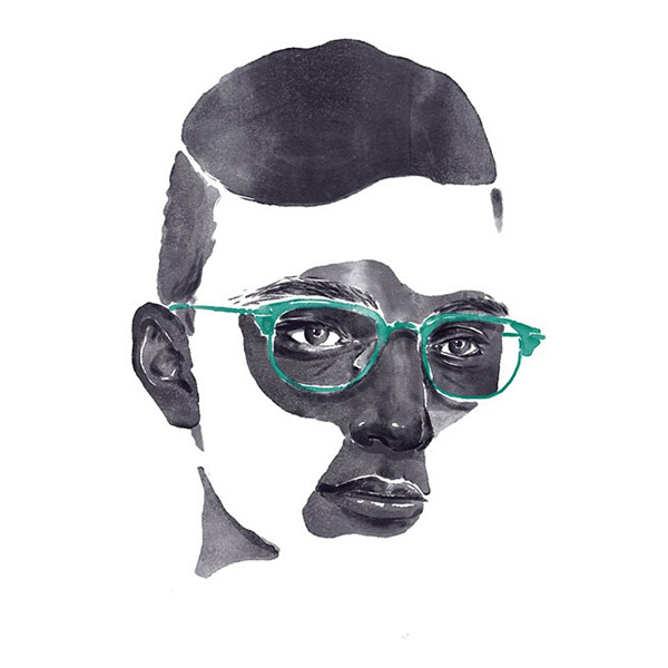
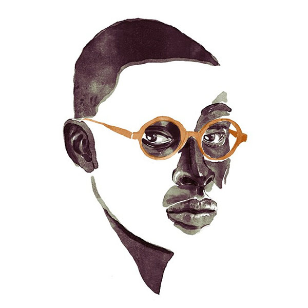
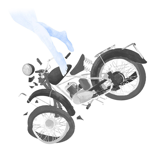
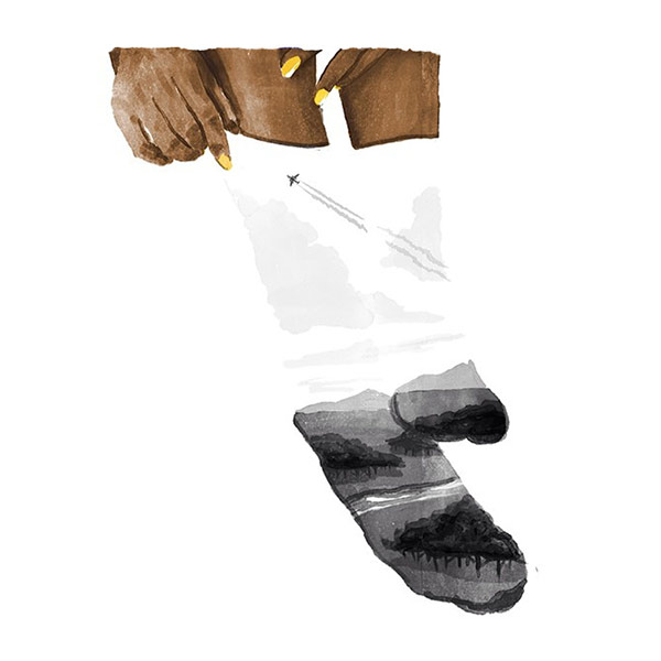
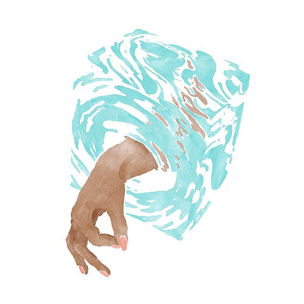
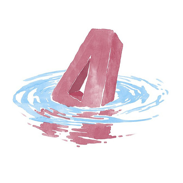
Today, while browsing through the pages of 'Booooooom', a creative inspiration website, I stumbled upon some amazing water colour studies by a Swedish illustrator and designer named Felix Roos. 

As a medium, watercolour paints have always interested me due to diverse range of the ways in which the paints can be applied and the stunning outcomes that can be produced. In fact, over the Christmas period, I utilised the qualities of watercolour paints to my advantage, applying them to create a range of tranquil mushroom illustrations for a wallpaper repeat pattern. 

Upon seeing the studies by Roos I was instantly amazed, not only by his ability to apply the paints, but also with the originality of his pieces. Of the works featured below my favorite studies are undoubtedly the hand reaching through a cube of water and the range of fragmented faces.    


fr9

fr8

fr7

fr5

fr3

fr2


Wednesday 14 January 2015

PPP3 - INSPIRATION

Today I watched a short video featuring Aaron Draplin, a well known graphic designer who was born and raised in America. In the video, Aaron takes on a logo challenge from 'Lynda.com' in which he must complete a design for a logo within a fifteen minute timeframe. 

Most logos are not designed in such a short amount of time and require much more development. However, Aaron's vast experience enables him to create a successful outcome within the specified timeframe while documenting his process and decisions for the viewer. 

The video appealed to my professional interests and has relevance to my development as a designer due to the fact that I am continually looking for ways to improve my practice. Watching the video allowed me to analyse a professional designers methodology while solving a design problem, something that is both interesting and useful.   


While watching the video I took notes documenting aspects of Aaron's design process that can in turn help me to improve as a designer.

NOTES -  


Saturday 10 January 2015

PPP3 - INSPIRATION

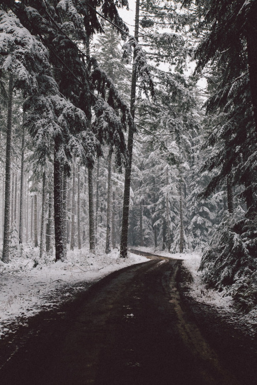
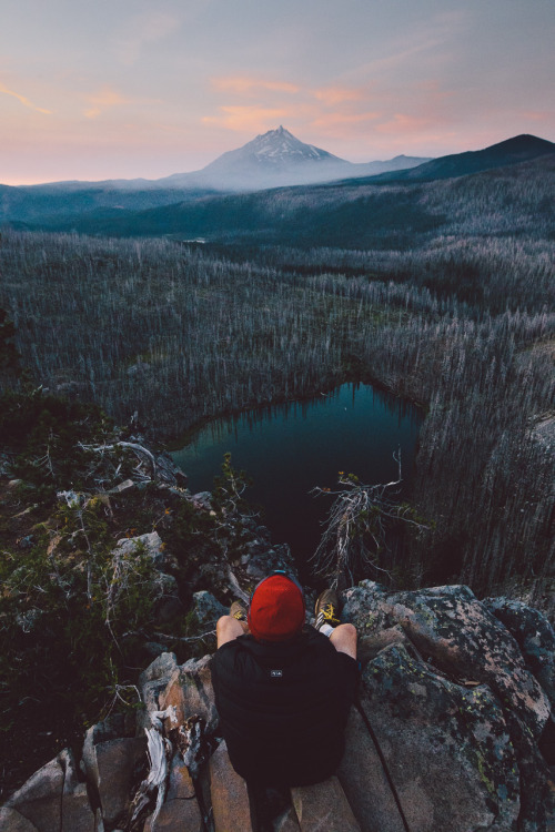
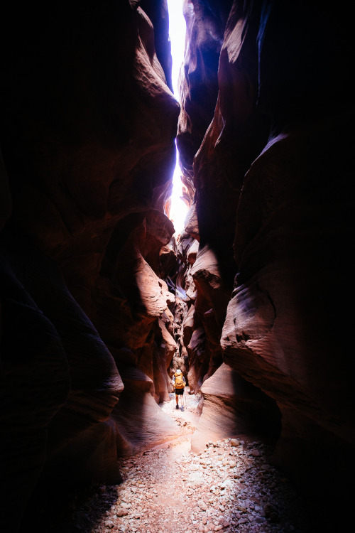
'A field guide to birds' is a photo journal by intrepid explorers Marc Adams and Jason Domogalla. 

As an individual with a serious case of incurable wanderlust and an inextricable love for the outdoors and adventure, the series of images documenting Marc and Adams excursions is completely awe-inspiring. 

Although not directly related to graphic design, I find anything that simultaneously documents the inherent beauty of our world and the journeys people take to experience it far more exciting and inspirational than the majority of secondary sourced inspirational material.  

The set of images displayed below illustrate some of Marc and Jason's adventures;


Link to blog - Link